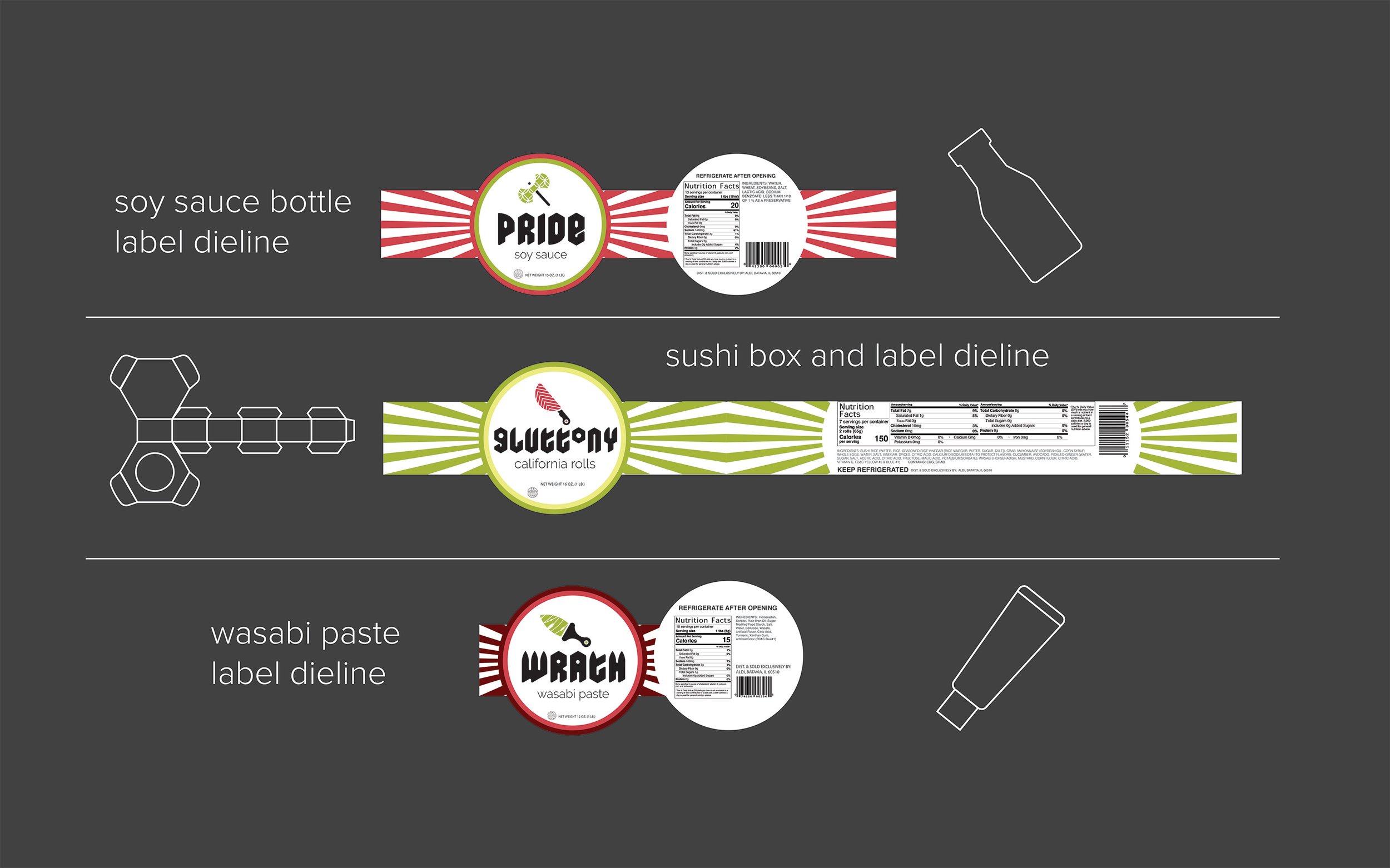
Seven Sins Packaging
Seven Sins Packaging is a packaging design project that uses three of the seven deadly sins to brand three different products relating to the concept of weaponry. The concept is built from the Hebrew word for sin, “khata” which translates to “to miss the goal.” A sushi box, soy sauce bottle, and wasabi tube were labeled using unique branding and research, regulated, correctly formatted information about the products. The labels would be printed with soy-based ink and biodegradable packaging to uphold the company’s eco friendly values. The logo lockups were aimed at relating image to text and suggesting elements of the ingredients, as well as the Japanese flag.


